overview
A San Francisco-based venture capital/investment firm, TAO Capital (formerly TAO Capital Partners) supports companies through various stages of their life-cycle.
An incredibly successful and experienced businessman, the chief principal at TAO had a very specific design concept in mind when it came to branding his new firm—the 64th hexagram of the I Ching, which is part of the practice of Taoism and means "nearing completion." The I Ching book consists of 64 hexagrams, which is a figure composed of six stacked horizontal lines, where each line is either Yang (an unbroken, or solid line), or Yin (broken, an open line with a gap in the center).
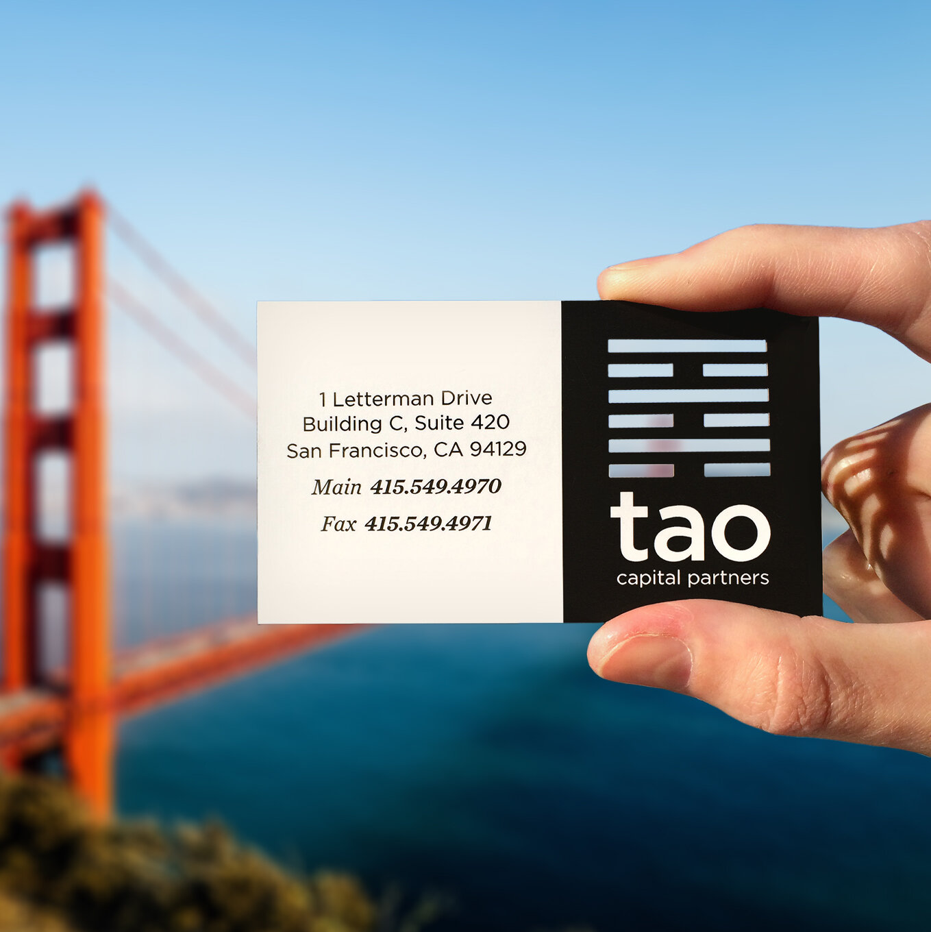
Due to the simple geometric nature of the final logo concept, it opened up some fun print technique options when it came time to designing the business cards. We ultimately went the die cut route and designed the cards in a way to incorporate the negative space of the icon on both the front and back sides of the card, leaving TAO with a one-of-a-kind leave-behind piece!
audience
TAO values businesses that have a positive impact and give back to the community, specifically in the areas of technology, alternative energy and transportation, healthcare, education, sustainable food and agriculture, consumer, and real estate. Their portfolio includes companies such as SpaceX, Tesla, Uber, SolarCity, DreamBox, Revolution Foods, Soylent, Warby Parker, and many more.
“Josie created our logo and branding package for our firm, Tao Capital Partners, and we were completely thrilled with her work in every way. The business card design is unique, and invariably attracts positive comments. She seamlessly integrated the logo into stationery and office signage. We continue to work with her for additional projects.”
— Nick Pritzker, Principal Tao Capital Partners


